3. Contracts, Production, Promotion
As I said when talking about titles, covers are publisher’s business. Or more accurately, the business of the whole publishing house, involving the design people and the sales and marketing people.
You’ll be asked for your opinion and asked to write a blurb. Don’t be deluded by a sense of power! Be constructive and creative; come up with good ideas, original angles, effective phrasings, and your publisher will seize on them. But what you’re supplying is no more than raw material. You don’t make the decisions on the finished product.
Of course, you can say No and hope you’ll be listened to. But grumbling ‘I don’t like this’ and ‘I don’t like that’ conveys a bad impression. If there’s something you truly don’t like, try to come up with better suggestions and positive alternatives.
As for the cover art, you have even less influence there. And remember that what matters is a striking image to make the book stand out on the shelves and seduce the casual browser into taking a peek inside. It doesn’t matter if the cover conveys the central features of your story; it doesn’t matter if it correctly depicts every detail of a particular scene. So what if there ought to be a river in the background or an extra combatant with a club? The only correspondence to be considered is whether it reflects the feel of the story overall.
A huge amount of work goes into covers. I’ve heard it said that a book’s cover determines 50% of its sales—how scary is that? You can see why a publishing house tries to team a sellable cover with sellable content. A cover is no mere incidental extra tagged on to the story within.
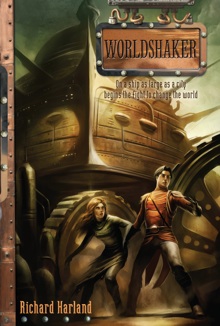
I’ve been incredibly lucky with the covers for Worldshaker. The Australian one is by Anthony Lucas (director of the Oscar and BAFTA shortlisted movie, Jasper Morello: the US one has beautiful greeny-bronze colours; and the UK one is the best of all, because it’s by my all-time favourite spec fic artist, Ian Miller, and he’s done an amazing job!! Three times lucky is way over the odds!
  
Side-by-side: the UK cover, US cover and Australian cover
|
